Hey there! I'm Quang, a Graphic Designer who actually loves Graphic Design.
Contact me at: [email protected](below are my projects, please click on the images to see more)
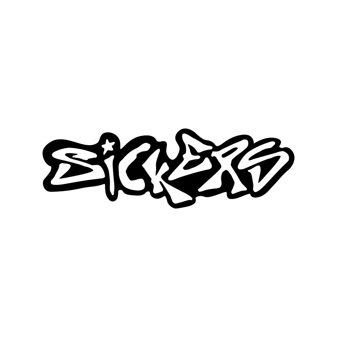


sickers is a small business based in Sudbury, Ontario that specializes in selling cool stickers.sickers’ logo captures the brand’s bold and expressive spirit through a graffiti-inspired typeface and a playful star in the letter “I,” symbolizing innovation and uniqueness.The experimental black outline echoes the idea of stickers breaking free from any shape while also making the logo resemble a sticker itself. A black-and-white colour palette enhances contrast and versatility, ensuring the logo remains sharp, impactful, and adaptable.
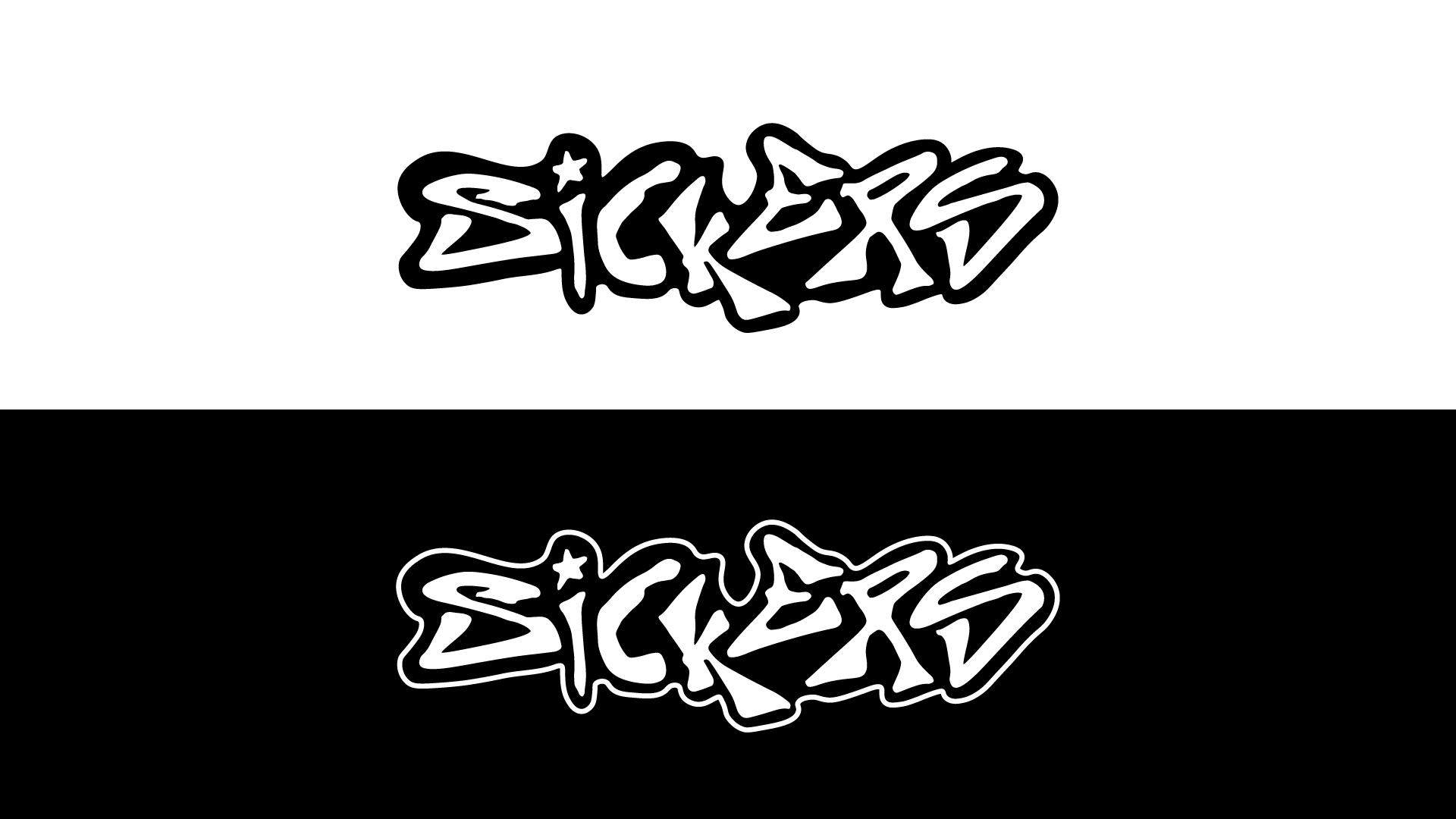
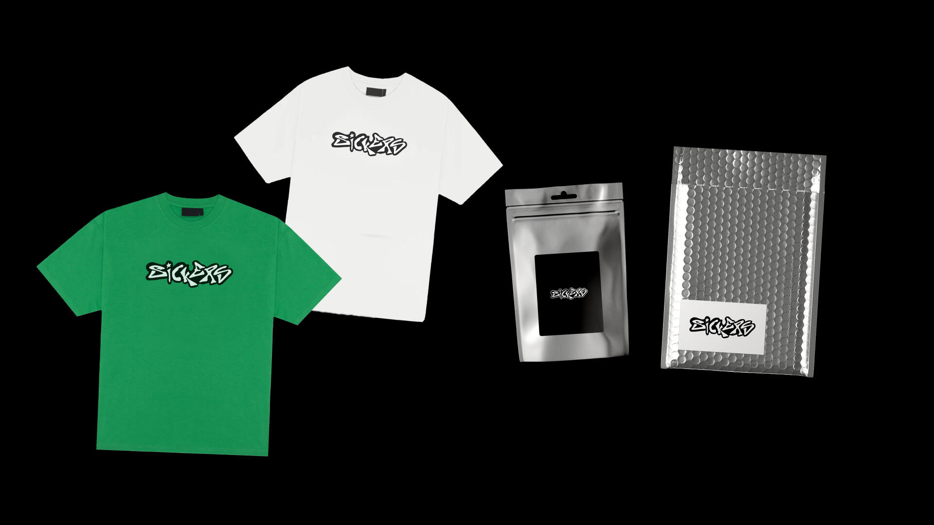
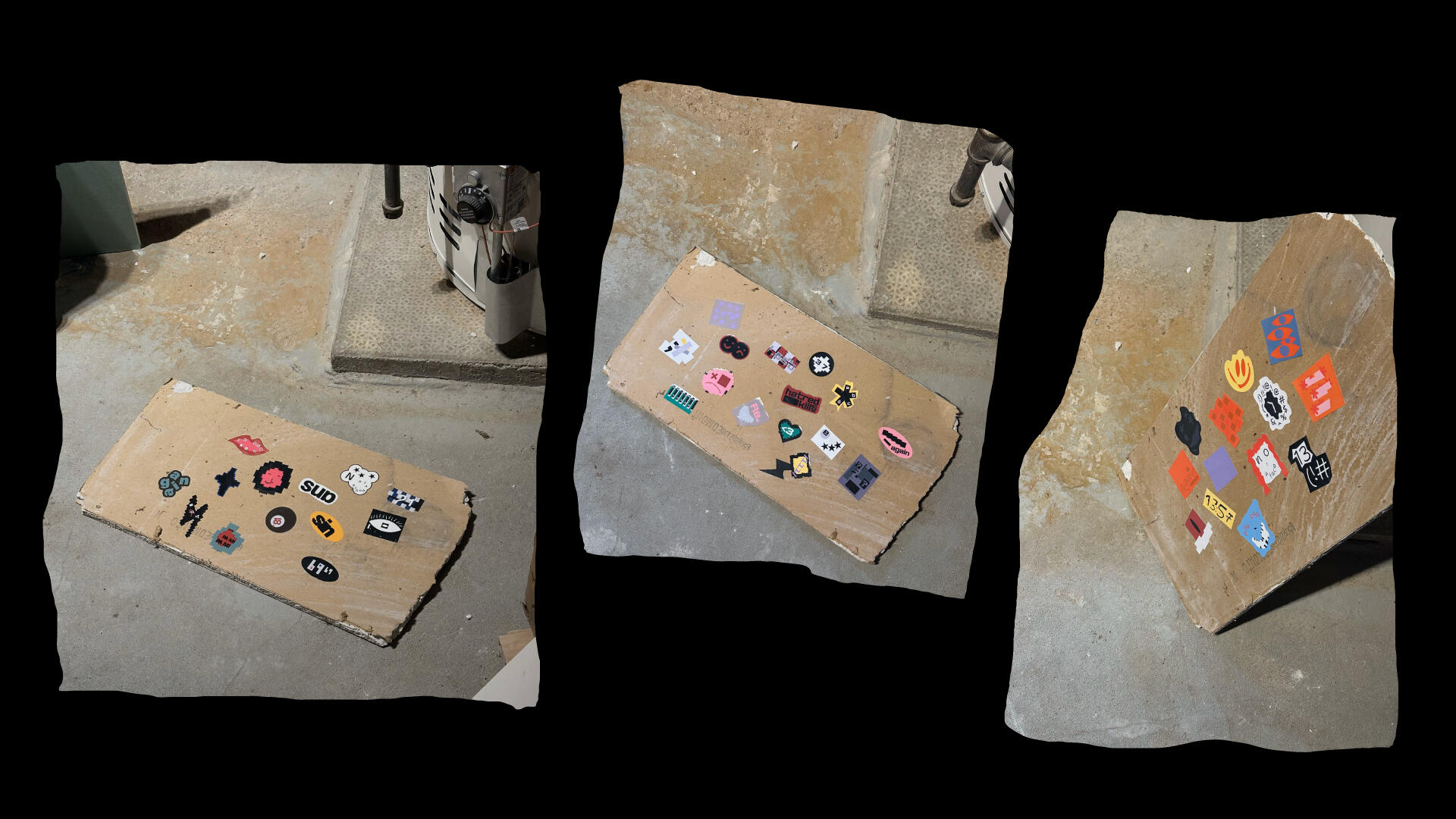
With a bold, abstract, and expressive design language, sickers' stickers aim to disrupt the conventional sticker scene, introducing a sense of controlled chaos and creative rebellion that challenges traditional aesthetics.

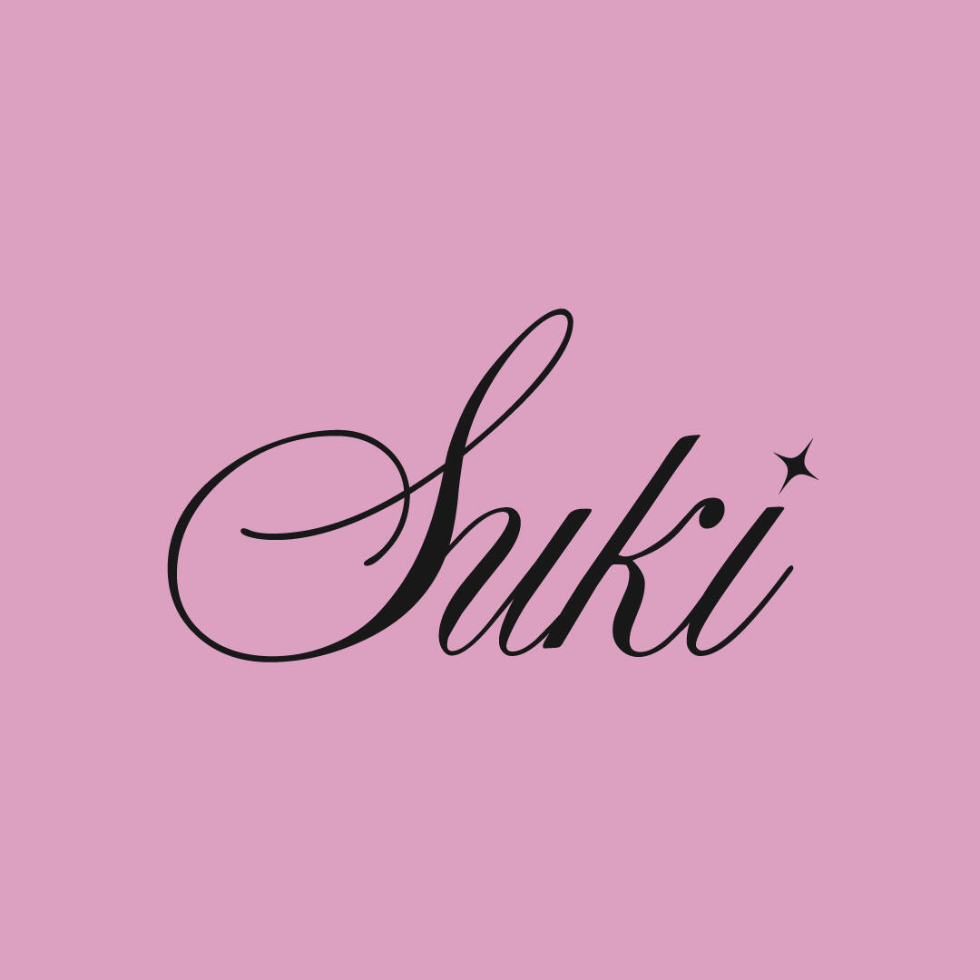
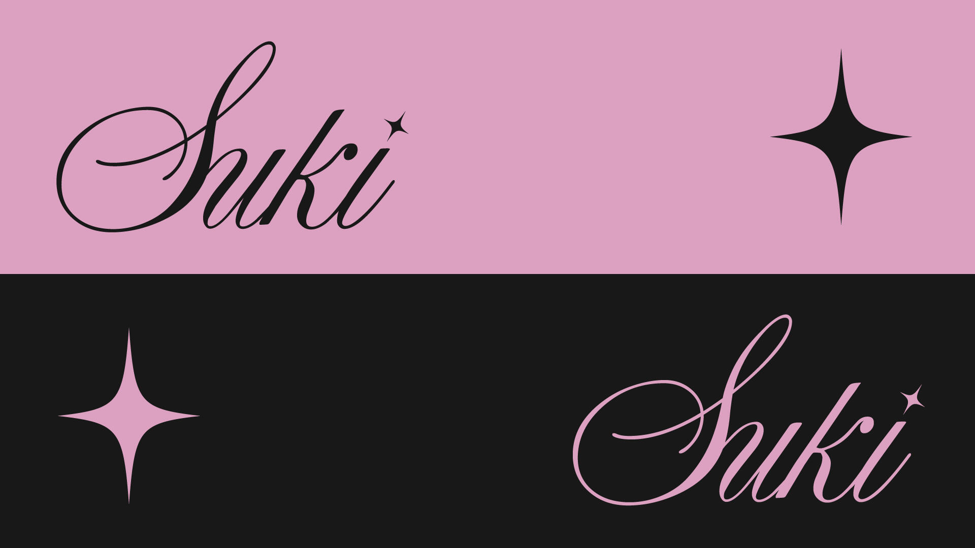
Suki is a boutique brand specializing in stylish, elegant, and high-quality press-on nails.Suki's logo embodies a harmonious blend of cuteness and elegance, expressed through a refined, modern script typeface and a soft pink colour palette that together evoke warmth, sophistication, and contemporary charm.
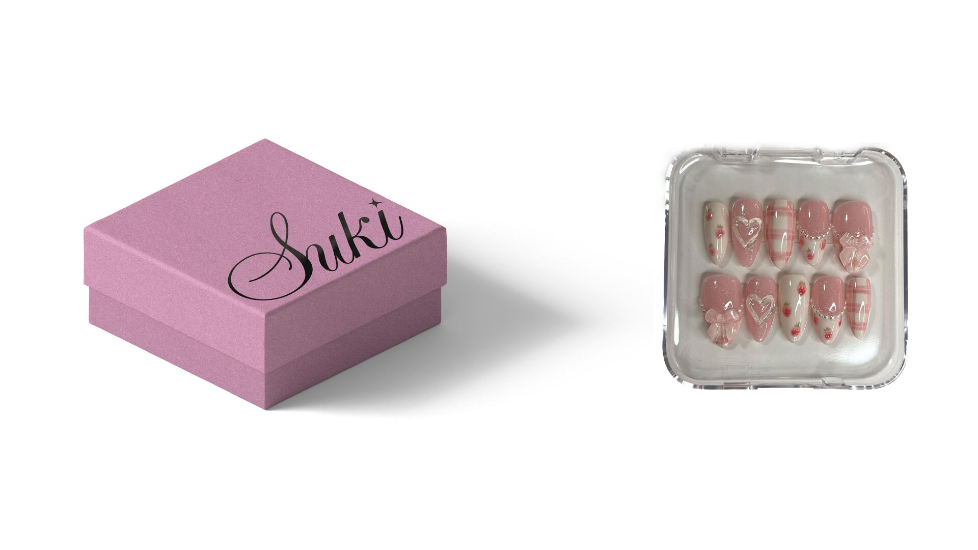
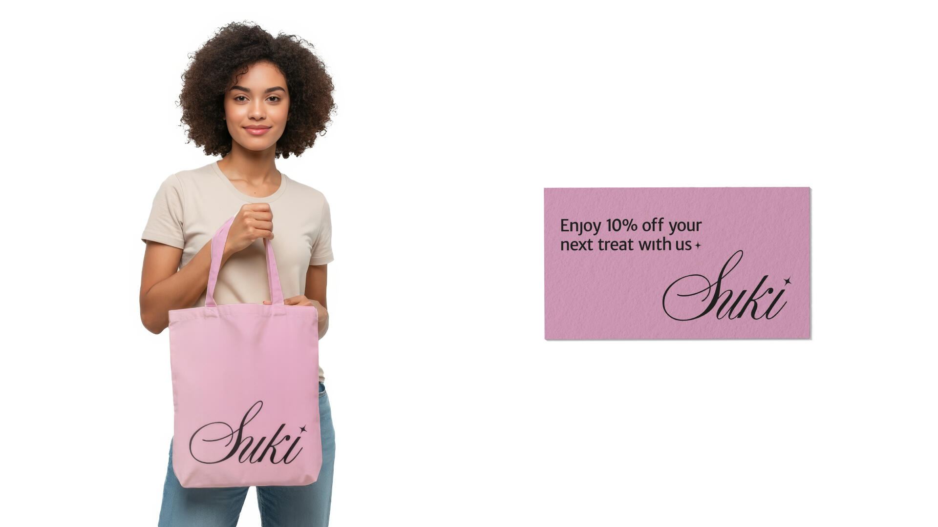
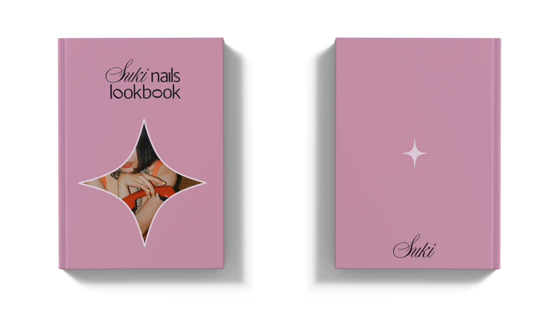
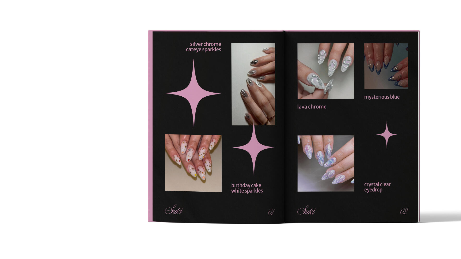
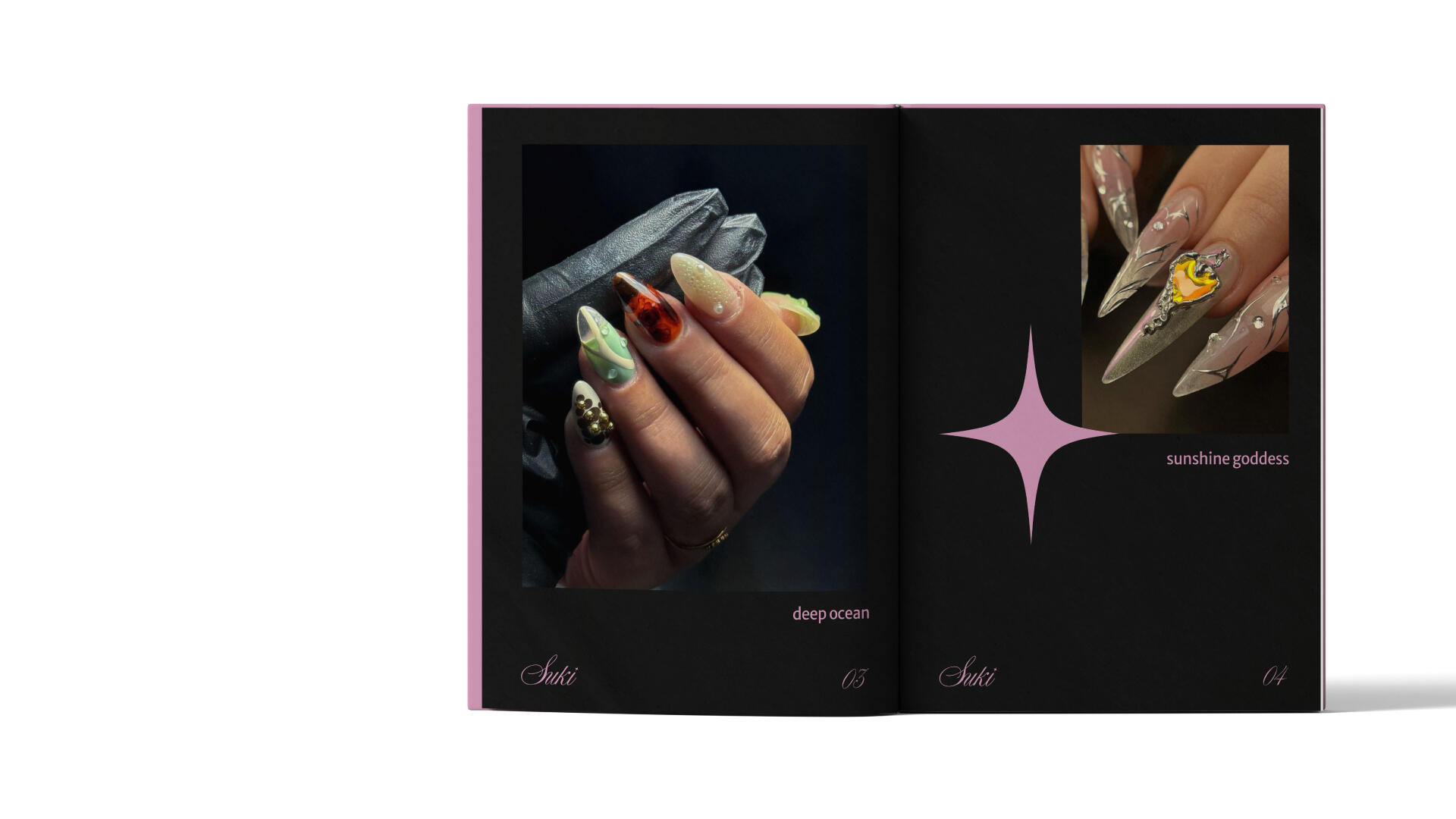
Suki seeks to transcend the stereotype of a typical press-on nails shop, offering high-quality, thoughtfully crafted products that elevate the experience for beauty-conscious individuals looking for something beyond the ordinary.

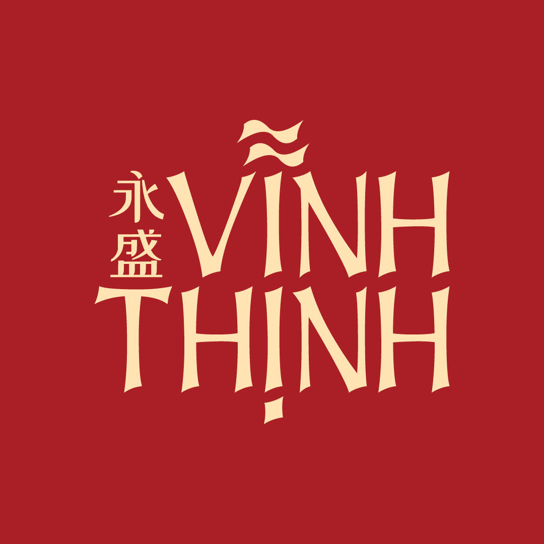
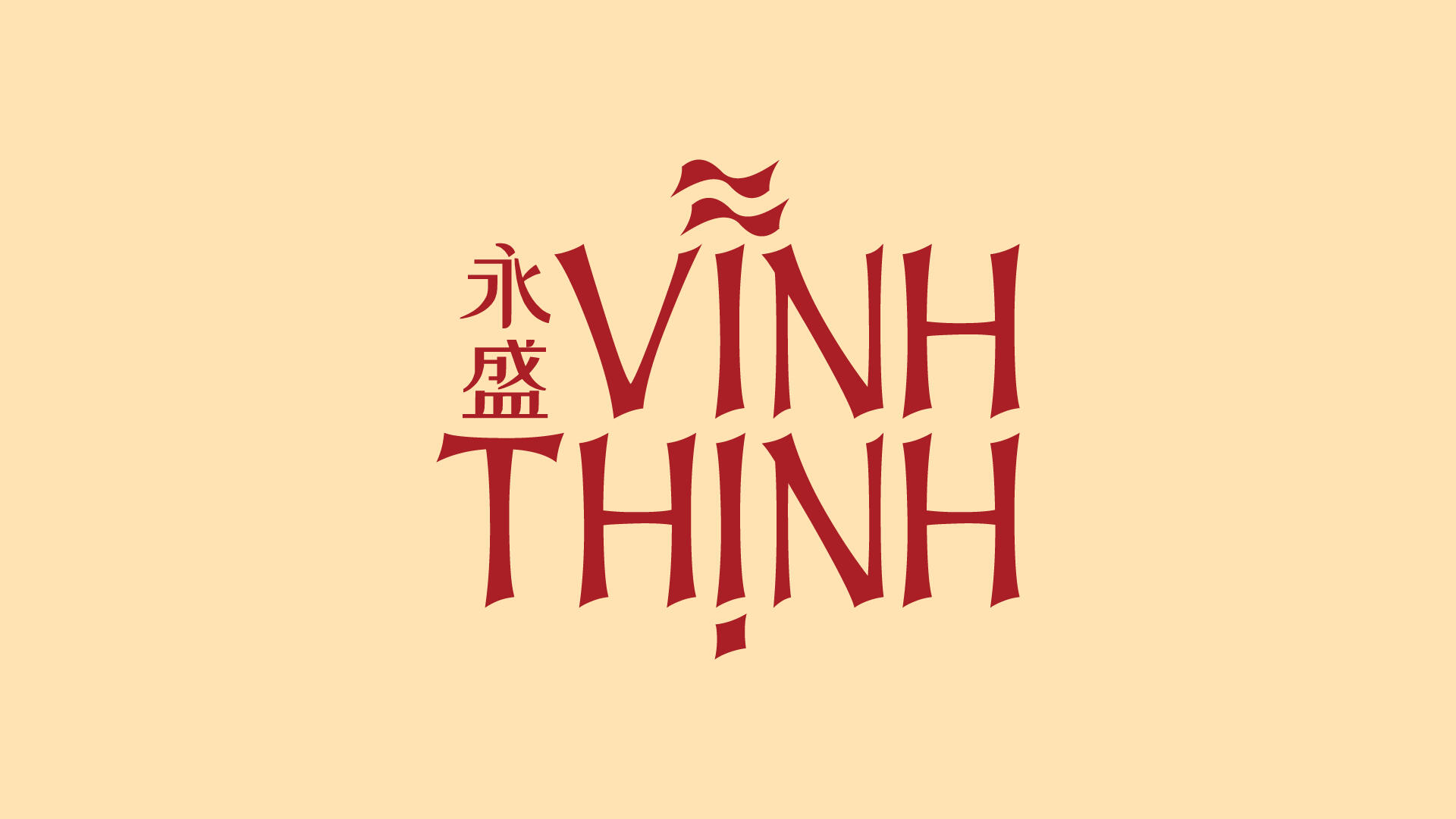
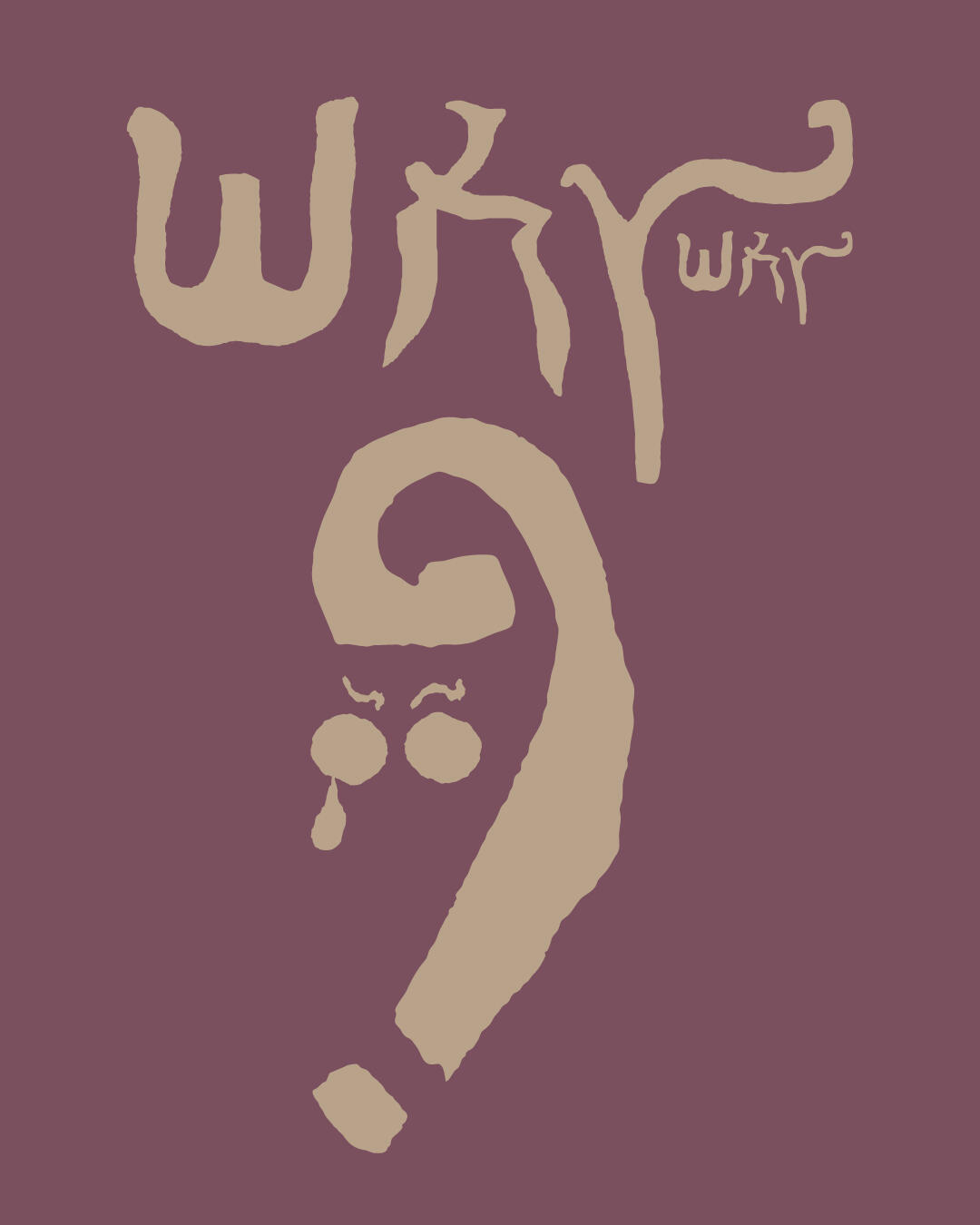
A friend of mine in Vietnam asked me to design a whole visual identity for his company "Vinh Thinh", which specializes in selling dried seafood. “Vinh” means “forever” and “Thinh” means “prosperous”, so the name of the company means “forever prosperous”.The typeface evokes a traditional Vietnamese aesthetic, while the use of red symbolizes luck and prosperity. The double “~” accent—an intentional deviation from the standard single tone mark—suggests the movement of waves.Additionally, the inclusion of two Chinese characters that translate to "Vinh Thinh" reflects the owner's Chinese-Vietnamese heritage.
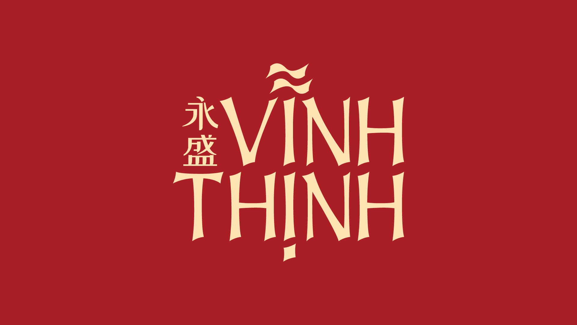
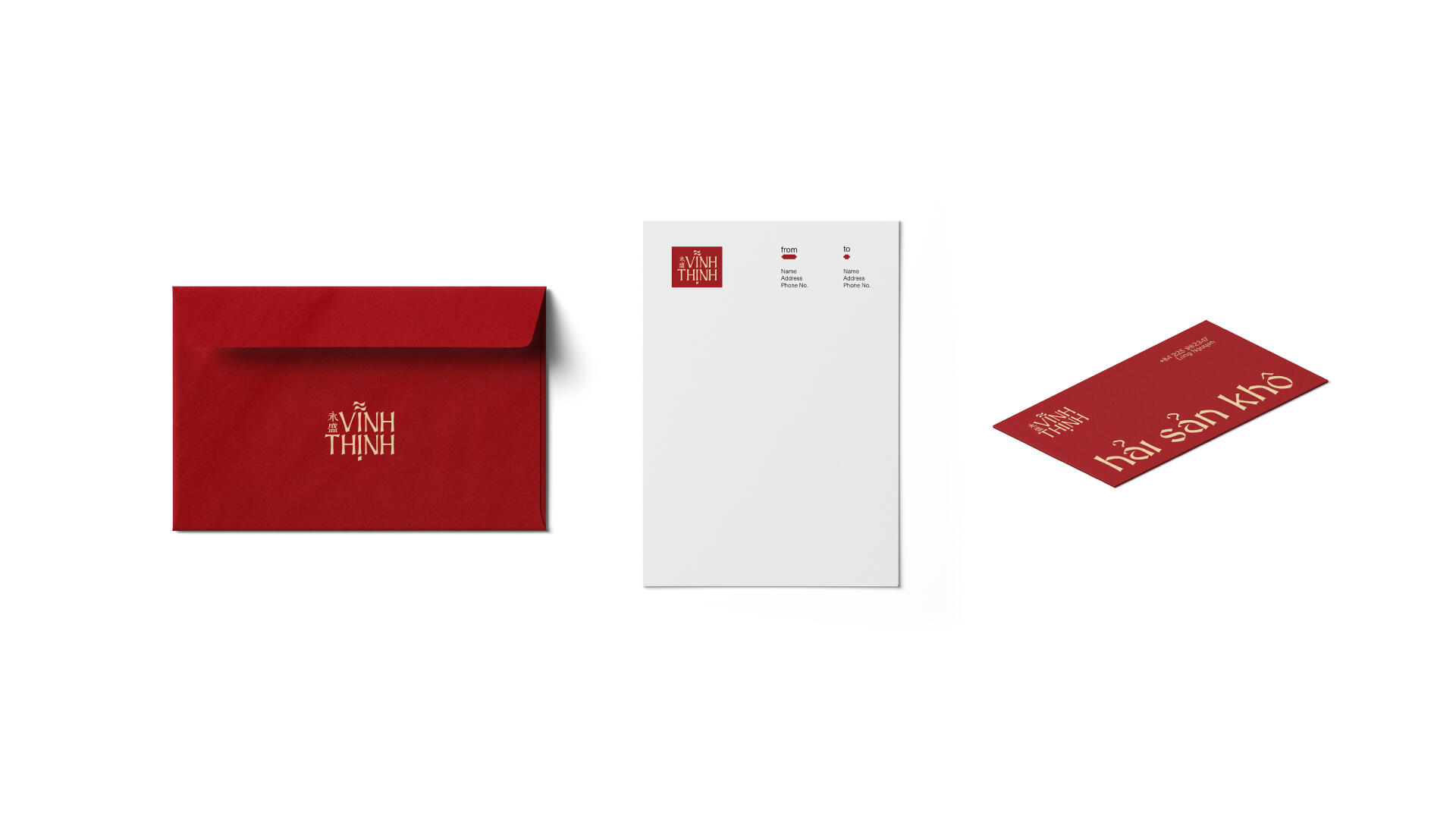
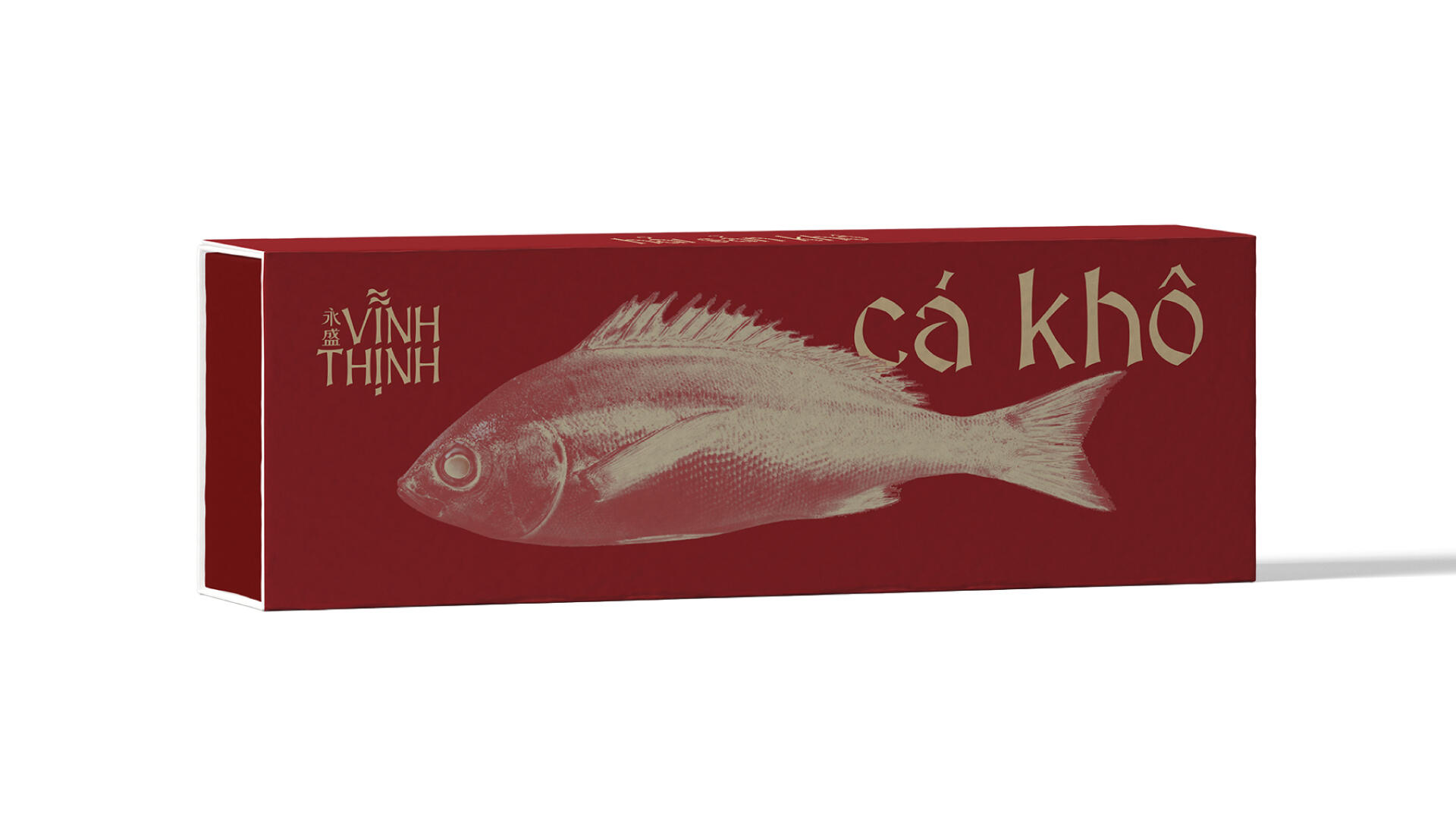
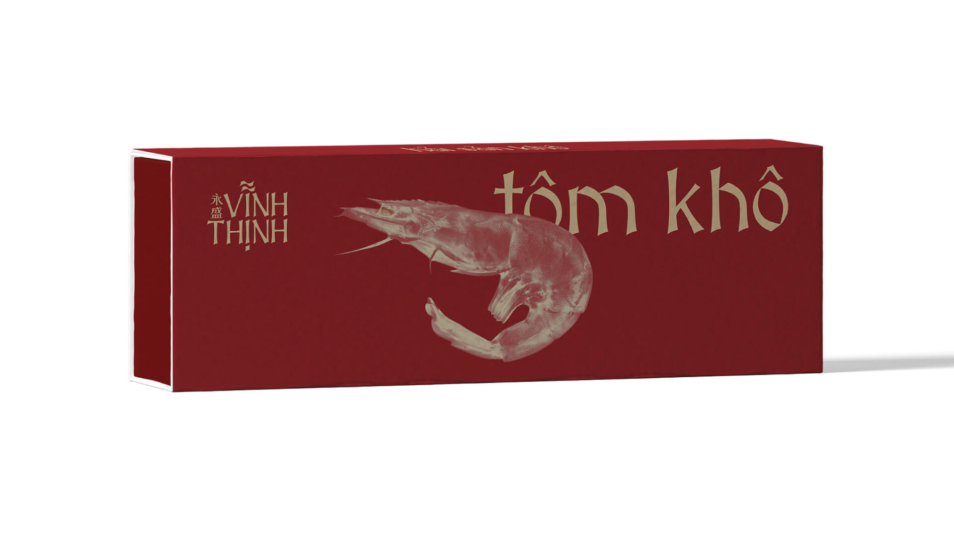
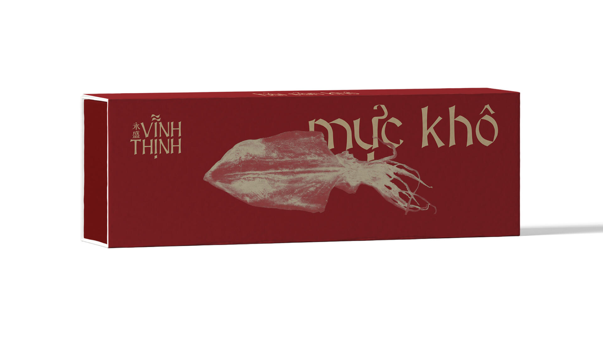
Vinh Thinh’s merchandise and packaging embody a traditionally modern Vietnamese aesthetic, striking a balance between cultural heritage and contemporary design—an approach that elevates the brand and reinforces its premium positioning in the market.

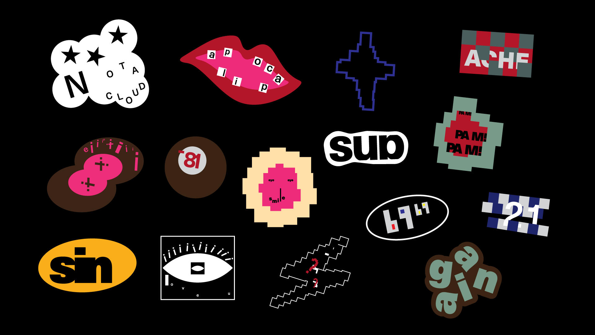
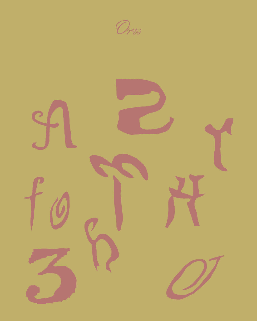
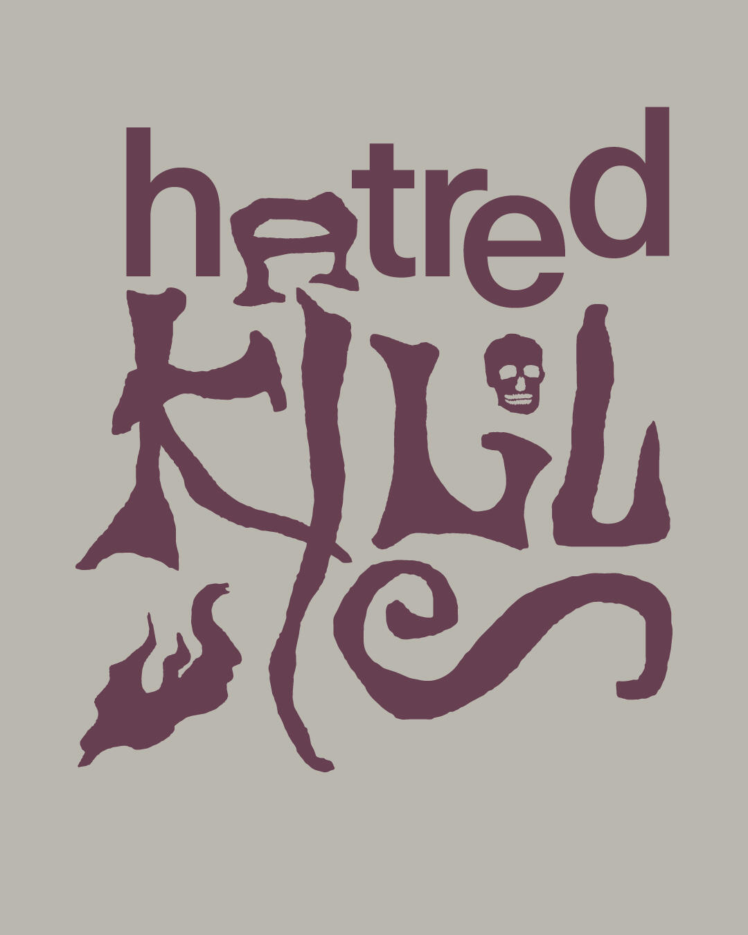
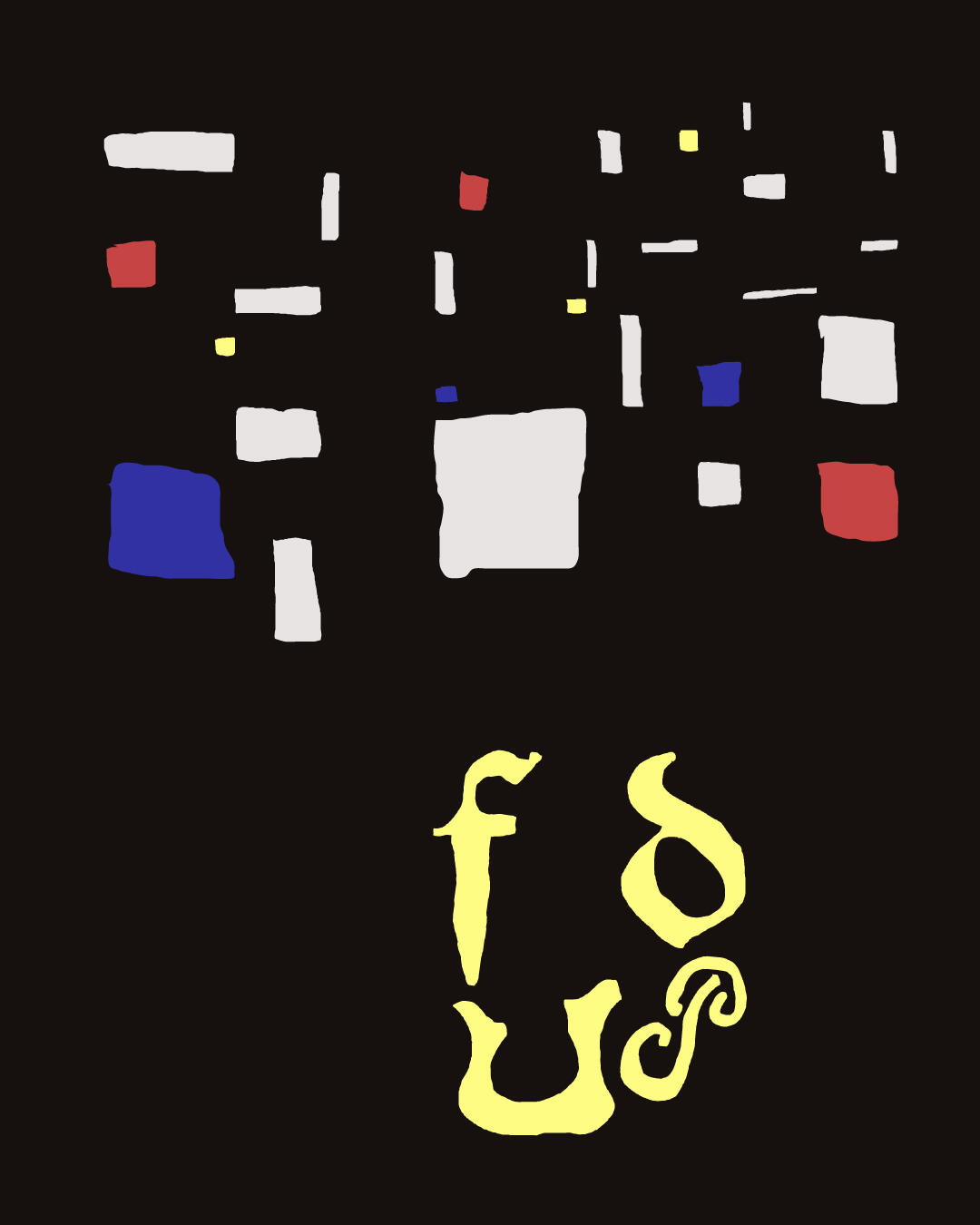
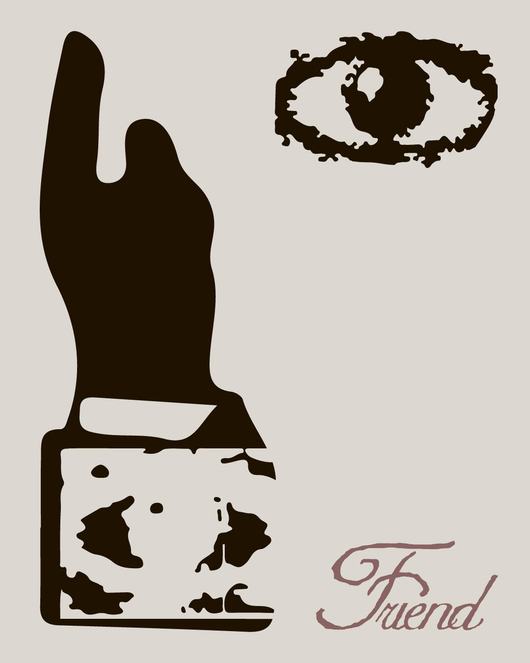
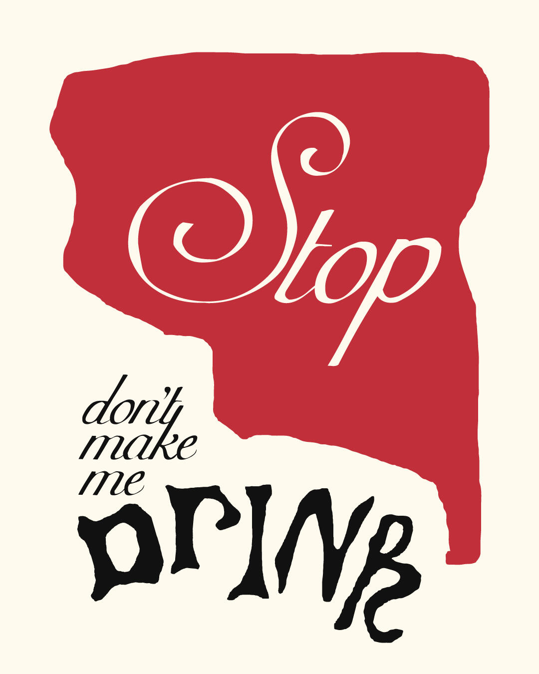
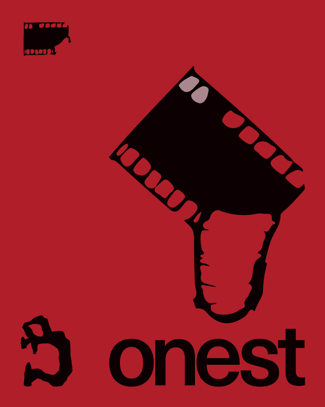
mallerie is my personal Instagram archive—a curated space where I share experimental poster designs created during my free time. It’s a visual playground for exploring bold concepts, unconventional layouts, and typographic expression.handle: @mallerie.design


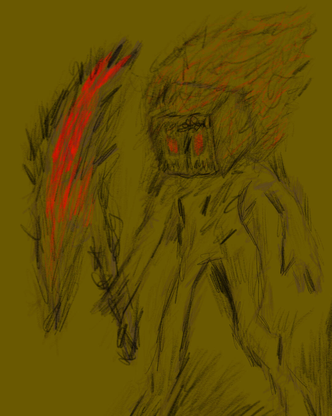
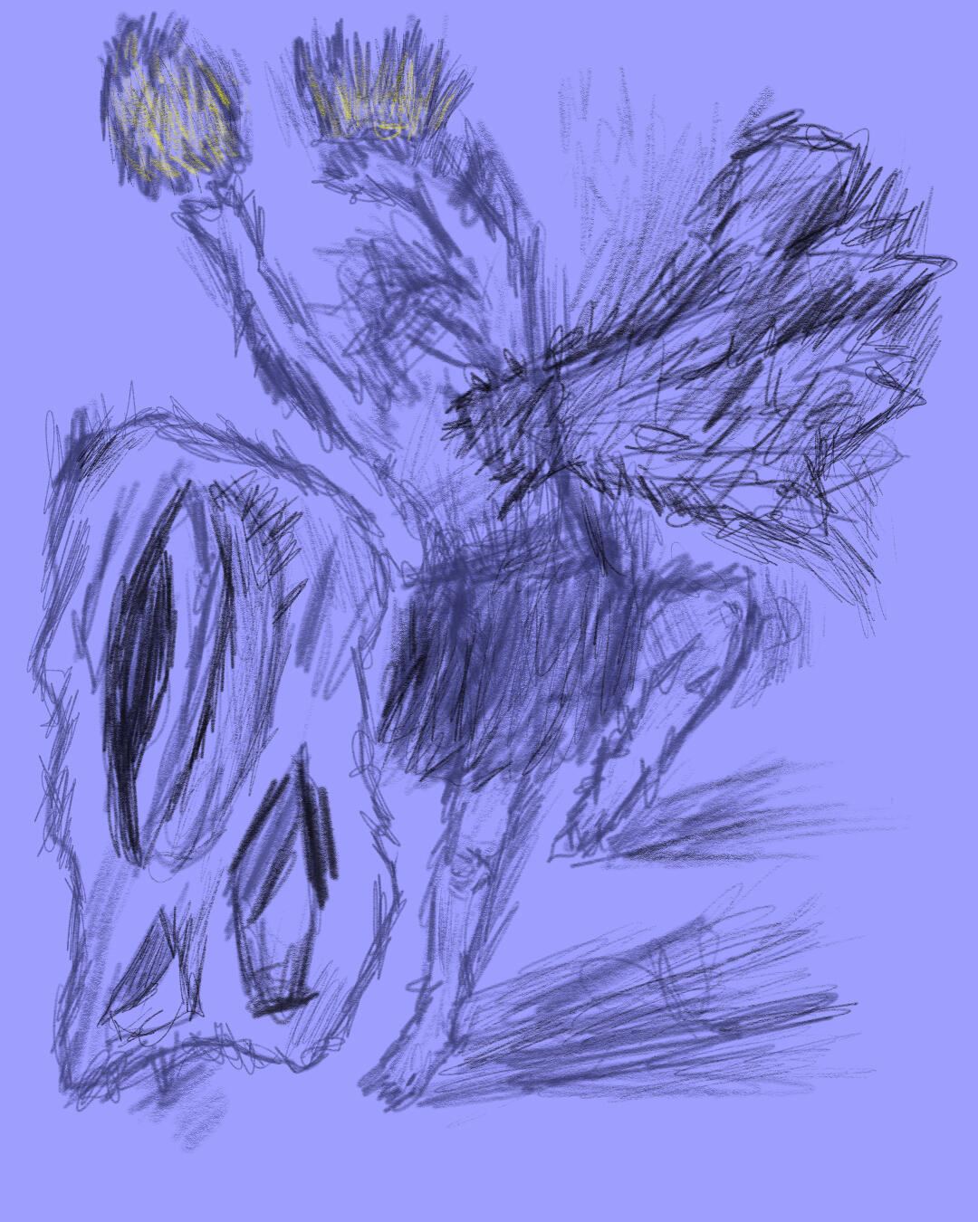
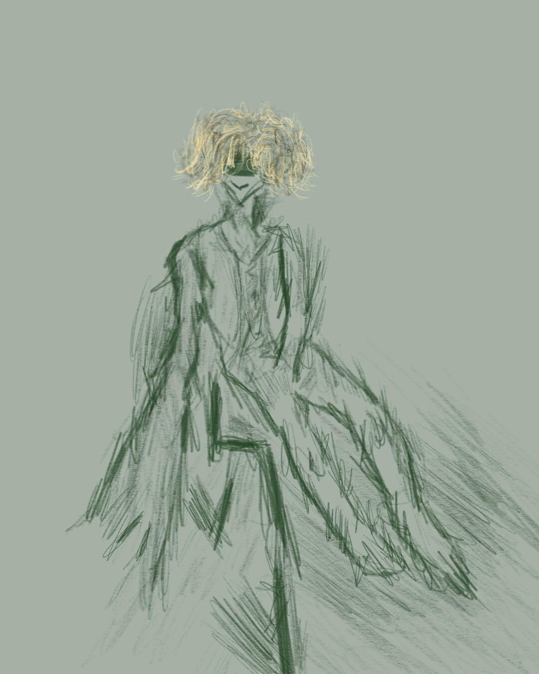
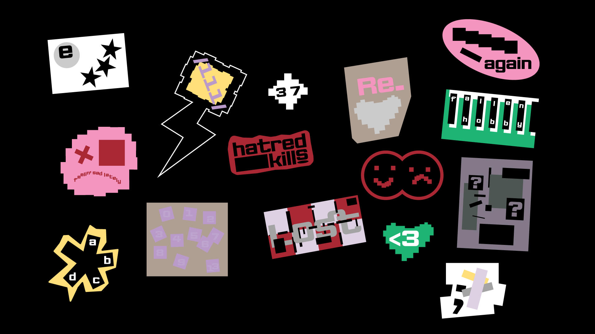
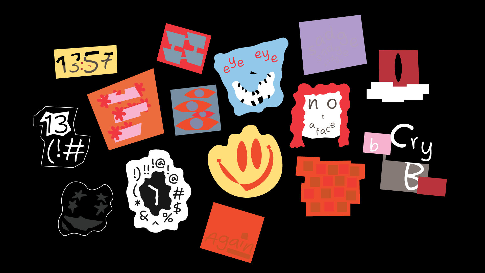
woephobia is another Instagram archive of mine—a lighthearted collection of digital sketches created during moments of graphic design burnout. It’s where I embrace the silly, the spontaneous, and the therapeutic side of making art without pressure.handle: @woephobia